Visualize your data with Excel charts! On this week’s One-Minute Wednesday, Greg Deleon will be showing you how to quickly turn a range of cells into a chart. This is a great way to understand and communicate your data when working with Excel.
Creating and Customizing Charts in Excel
An Excel chart gives you the ability to visually interpret your spreadsheet data between team members and clients. Let’s go over the steps of how to quickly create a chart in Excel.
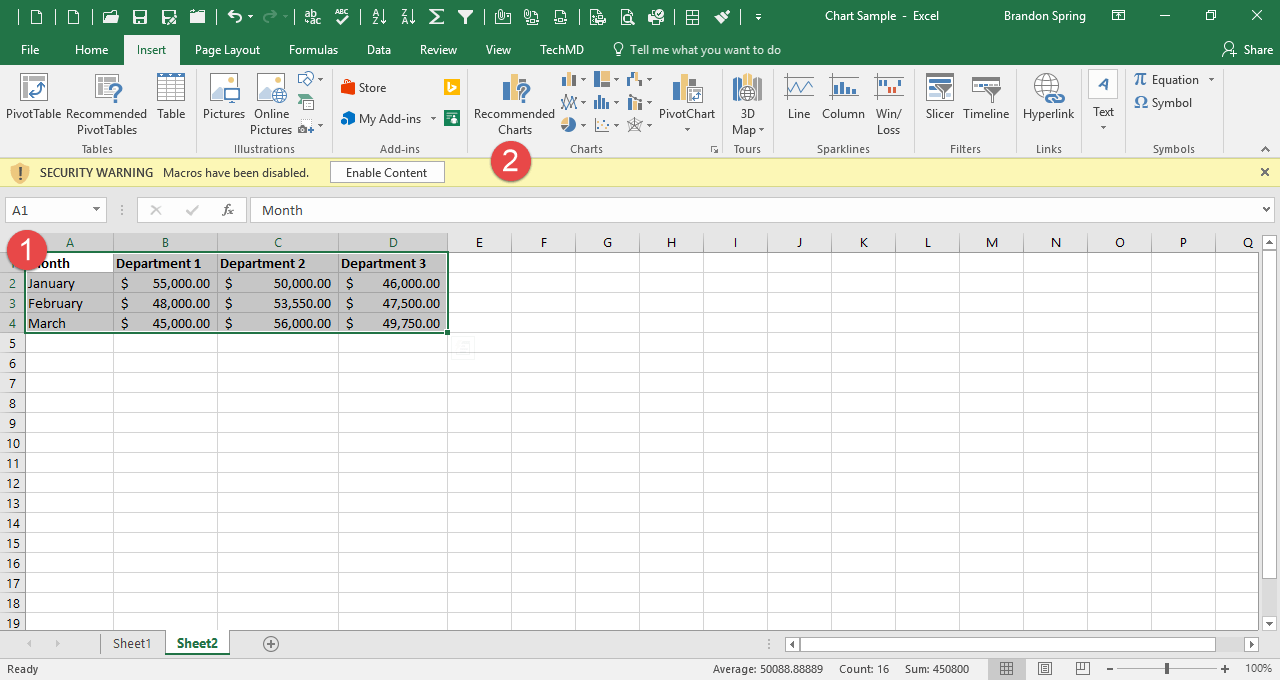
What we have below is a list of first quarter revenue that is separated across three departments within three columns. First, highlight all the columns and rows that contain information in your spreadsheet.
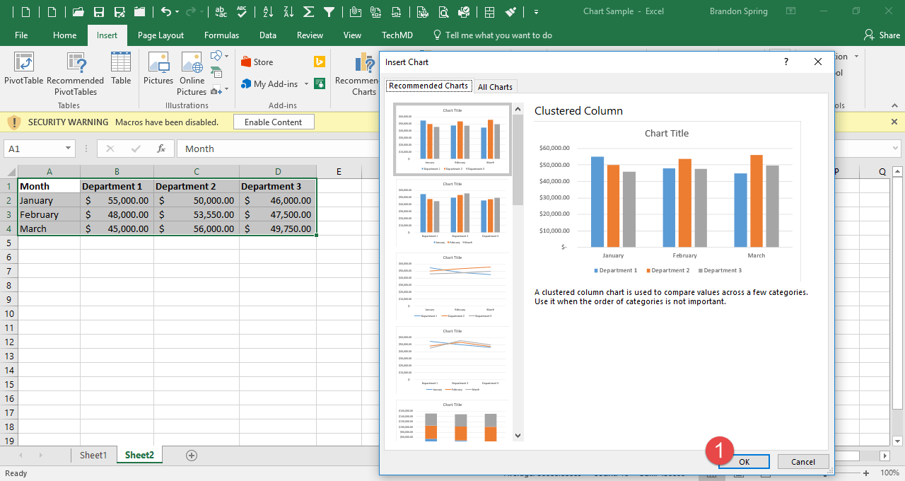
Now, click the insert tab and hit the “Recommended Charts” button and click “Ok”. Another method is a keyboard shortcut, “ALT & F1” which makes a chart instantly.
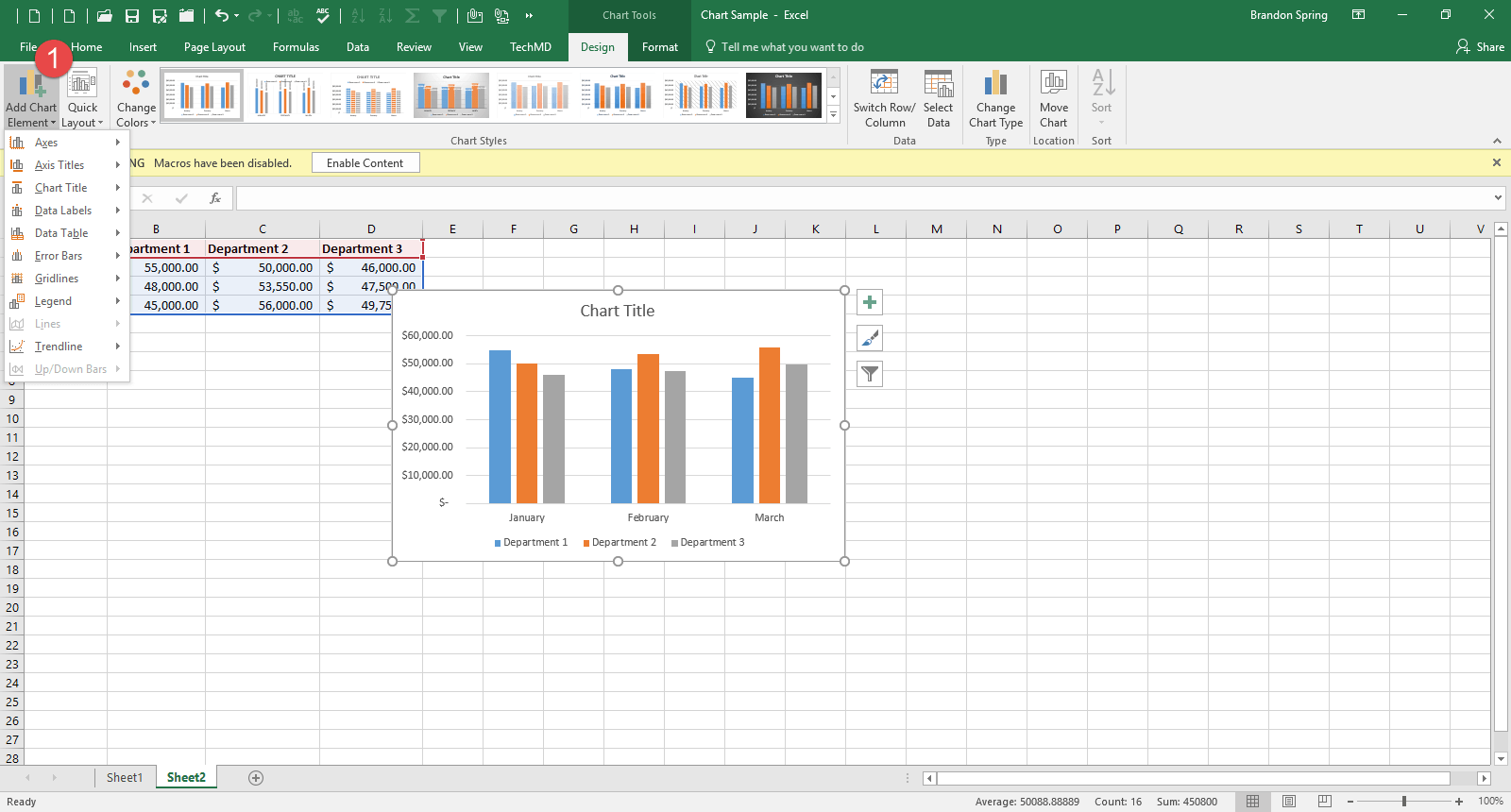
Now that the chart is available, you can begin editing its design and format with the “Chart Tools” menu. This menu contains a wide range of editing options to work with. You can add things to the chart such as a legend with the “Add Chart Element”:
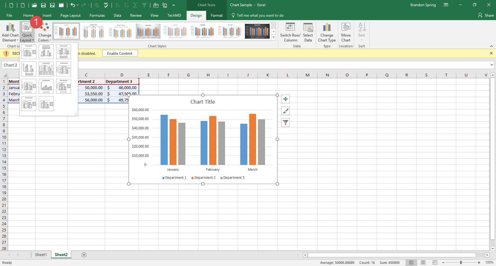
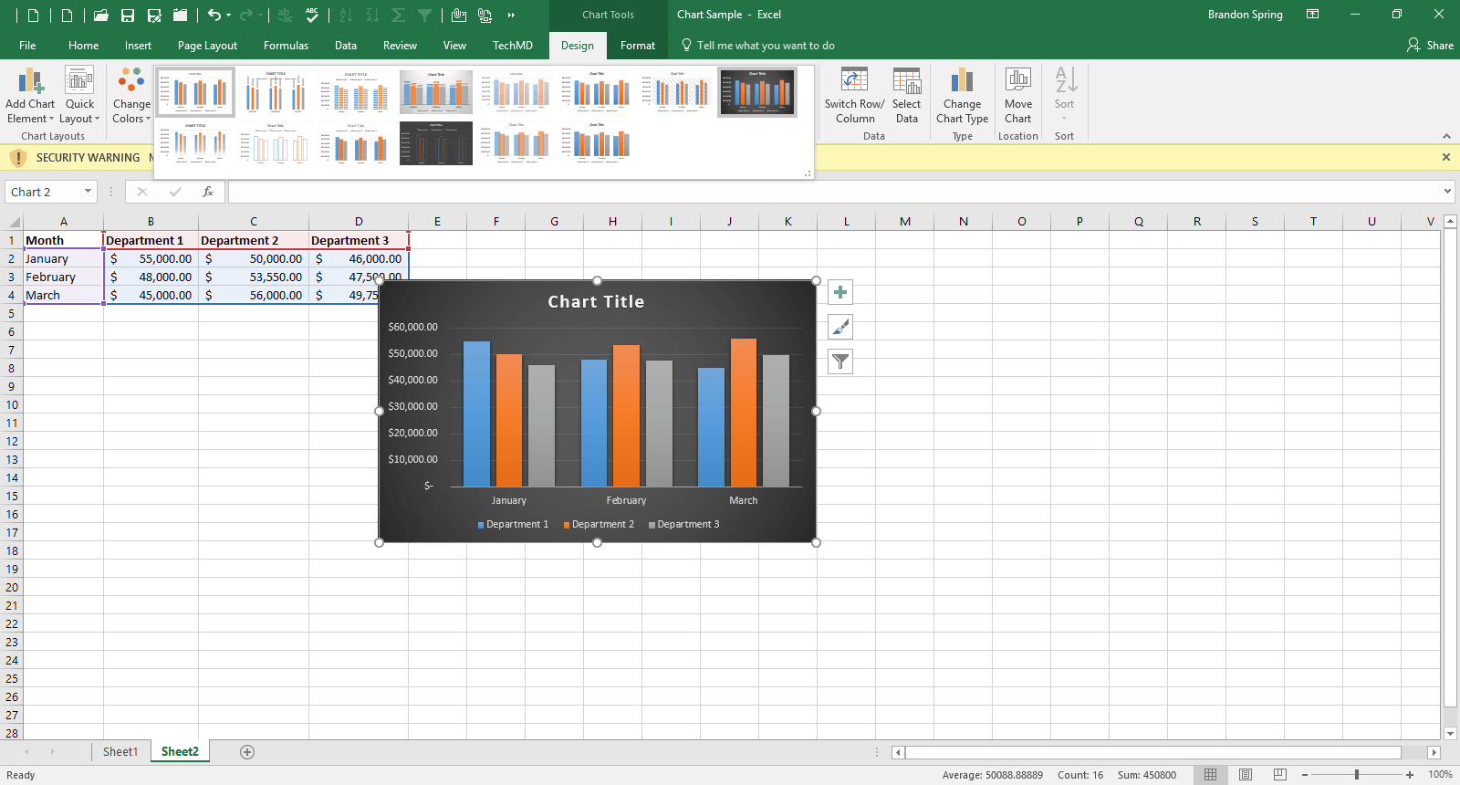
You can also change the layout with the “Quick Layout” button:
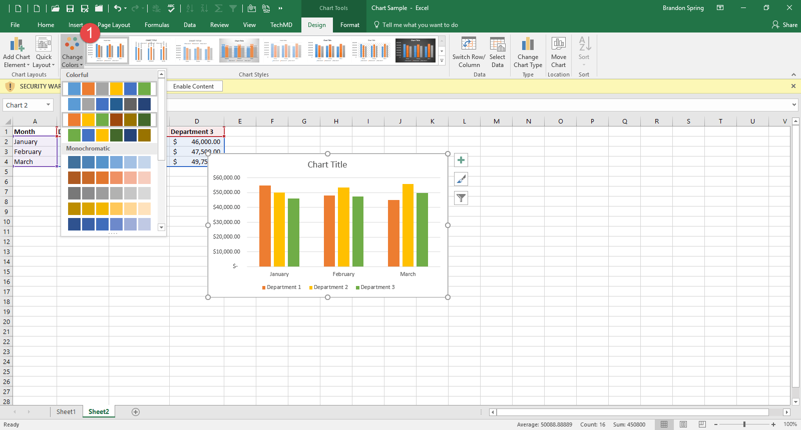
Finally, you can use new colors in the chart with the “Change Colors” button:
If you click the drop-down menu in the center of the Ribbon Bar, you will find a list of several chart styles to choose from should you wish to adapt the look of your chart.
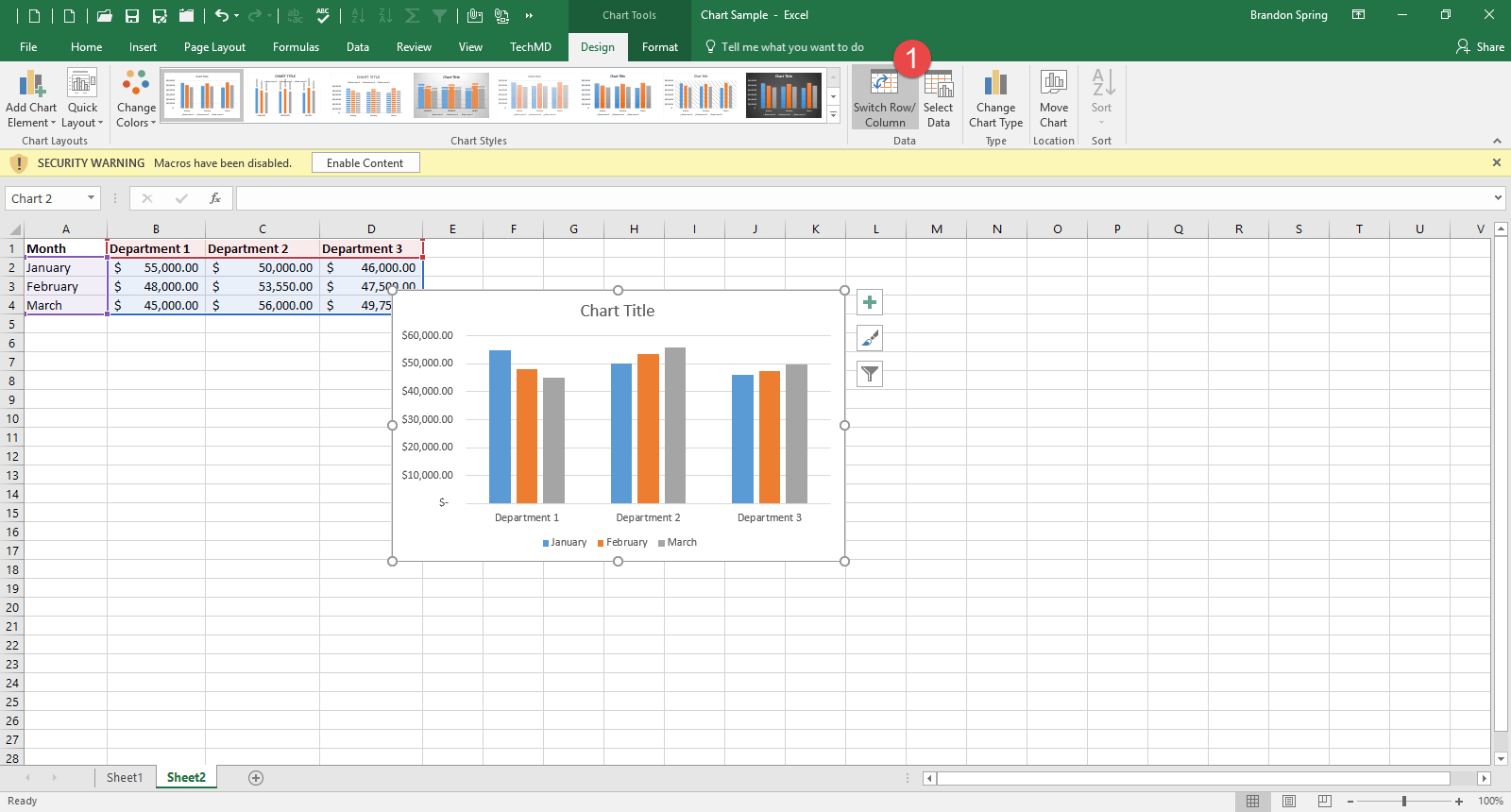
The “Switch Row/Column” button to the right switches the row and column fields in your chart:
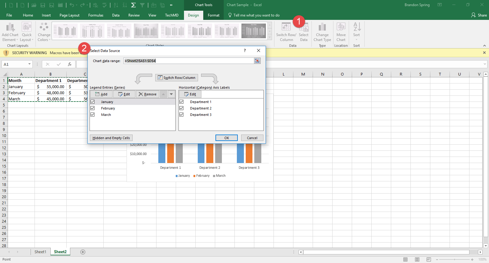
The “Select Data” button gives you the ability to adjust the data that’s contained in your chart:
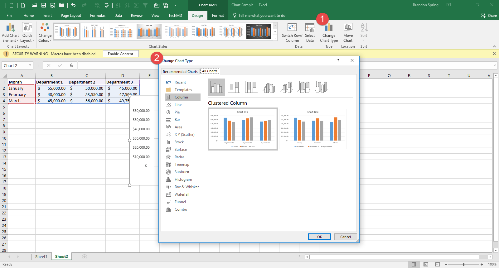
The “Change Chart Type” menu lets you choose between different types of charts depending on your subject:
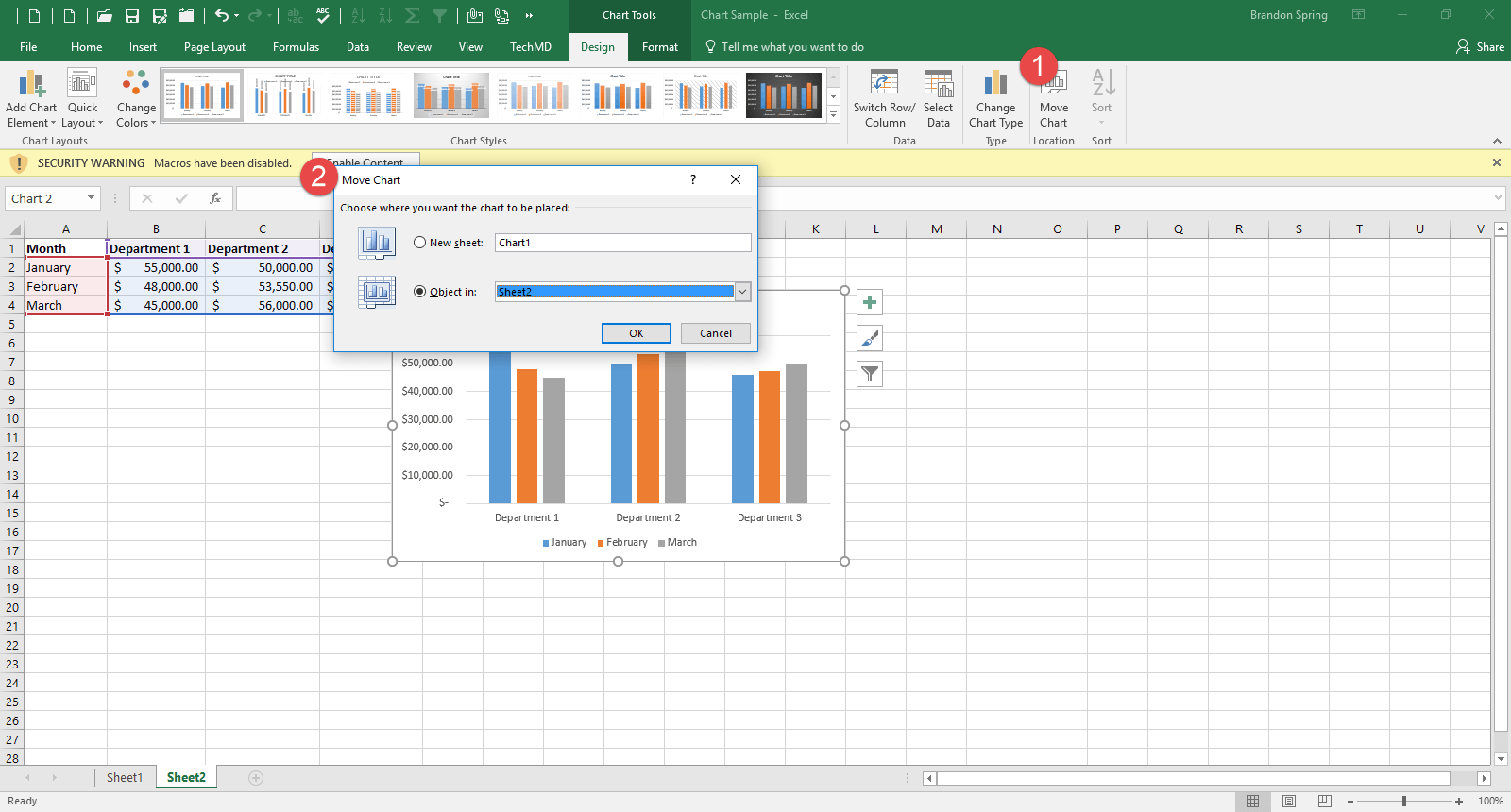
Finally, the “Move chart” button moves the chart to a new sheet in Excel:
Use these steps to create a chart that best fits your needs! Thanks for tuning in and we’ll see you next week!