Today we’re going to look a bit closer at Microsoft Planner in Office 365. Before, we saw the process of creating a new organized plan for your projects or events. Now we’ll show you how to navigate through the three main interfaces that Planner offers: Board View, Charts View, and Schedule View.
The Board View
When you first open a plan inside Planner, you’re taken to the Board View. This is the default interface which gives you an overview of all your buckets and subtasks.
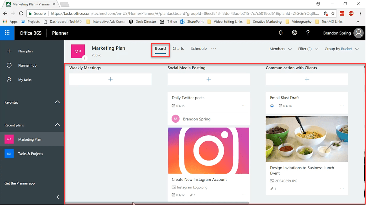
Here, you’re allowed the flexibility of reorganizing buckets by shifting tasks from one area to another, based on your preferences.
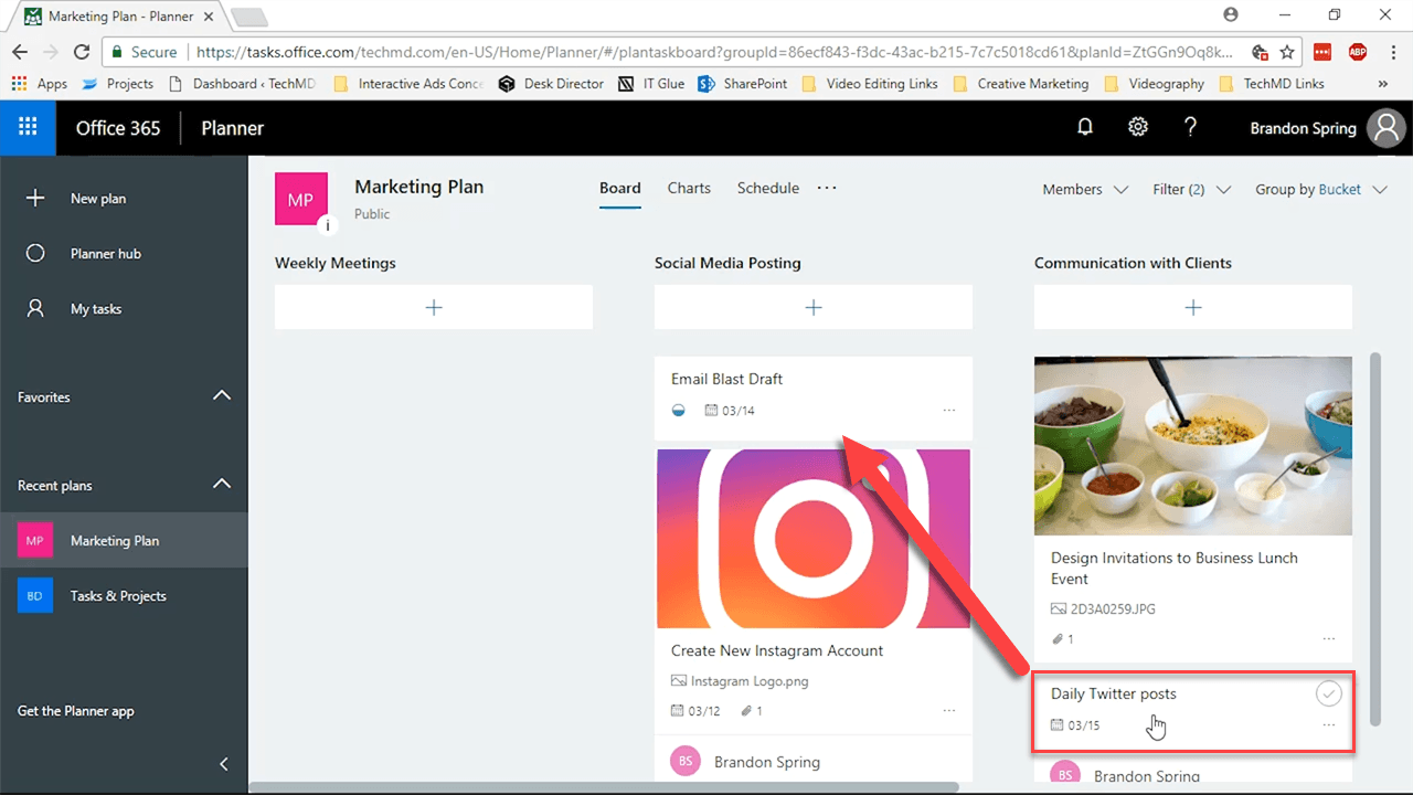
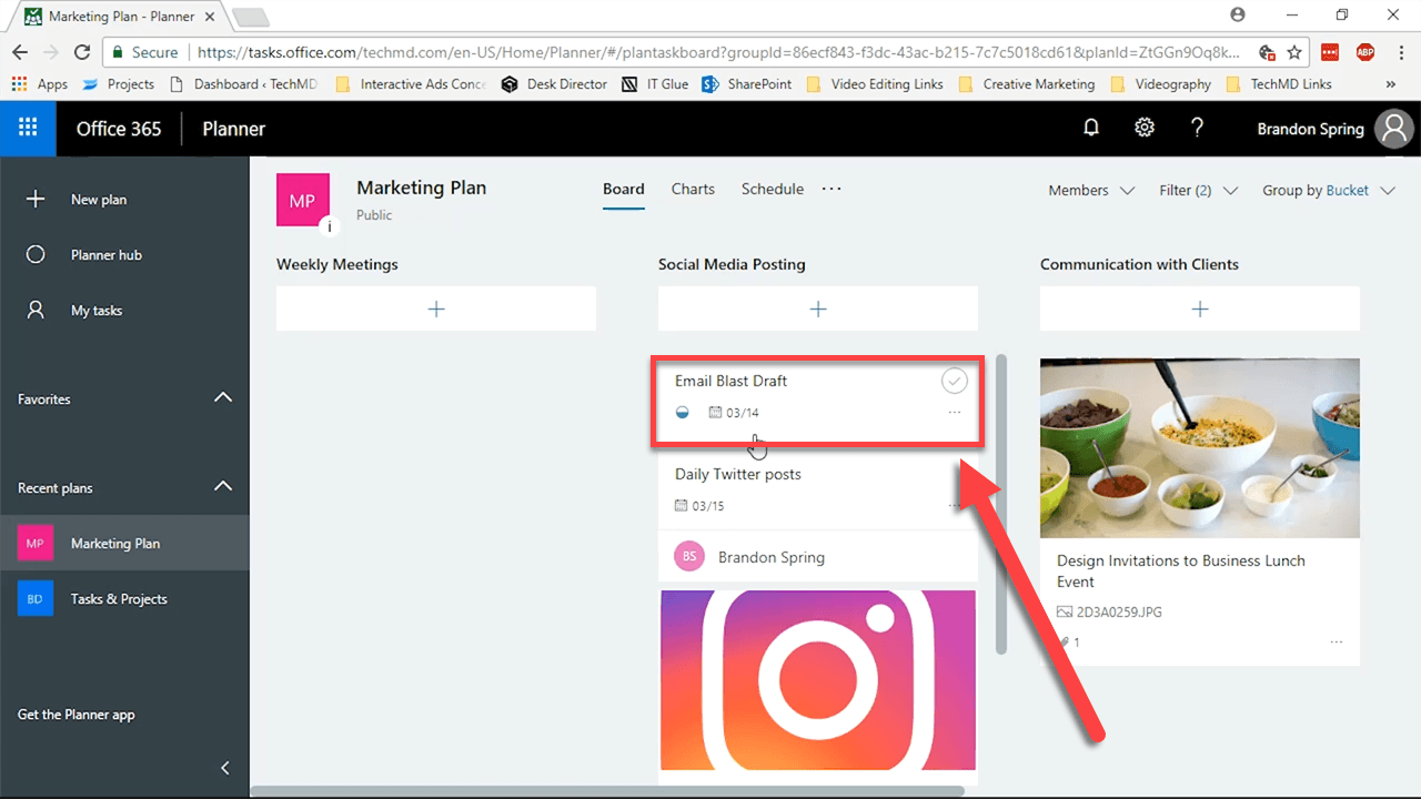
The only drawback in the Board is that you have to click individual tasks to get any details on their progress. To get more information on your overall tasks, we have the Charts interface.
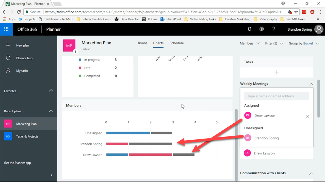
The Charts Interface
Now you’re in the Charts View, which will give you a visual and graphical outline of where each of your tasks currently are.
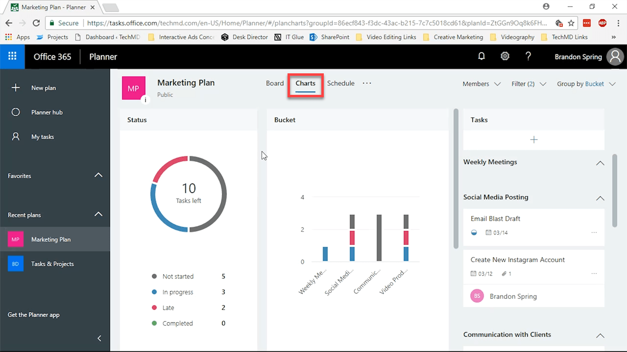
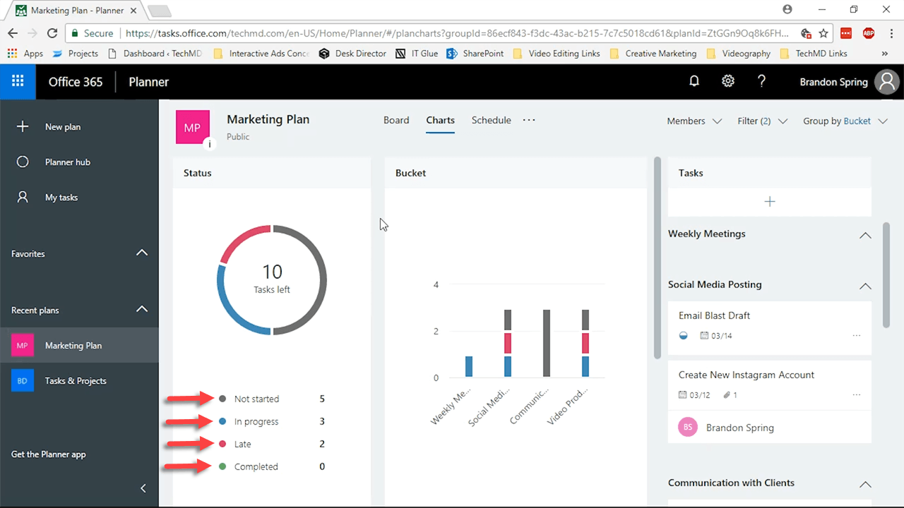
This is best seen in the “Status” window. There, you can easily see what projects are Not Started, In progress, Late and Completed. Each of these is indicated by a certain color.
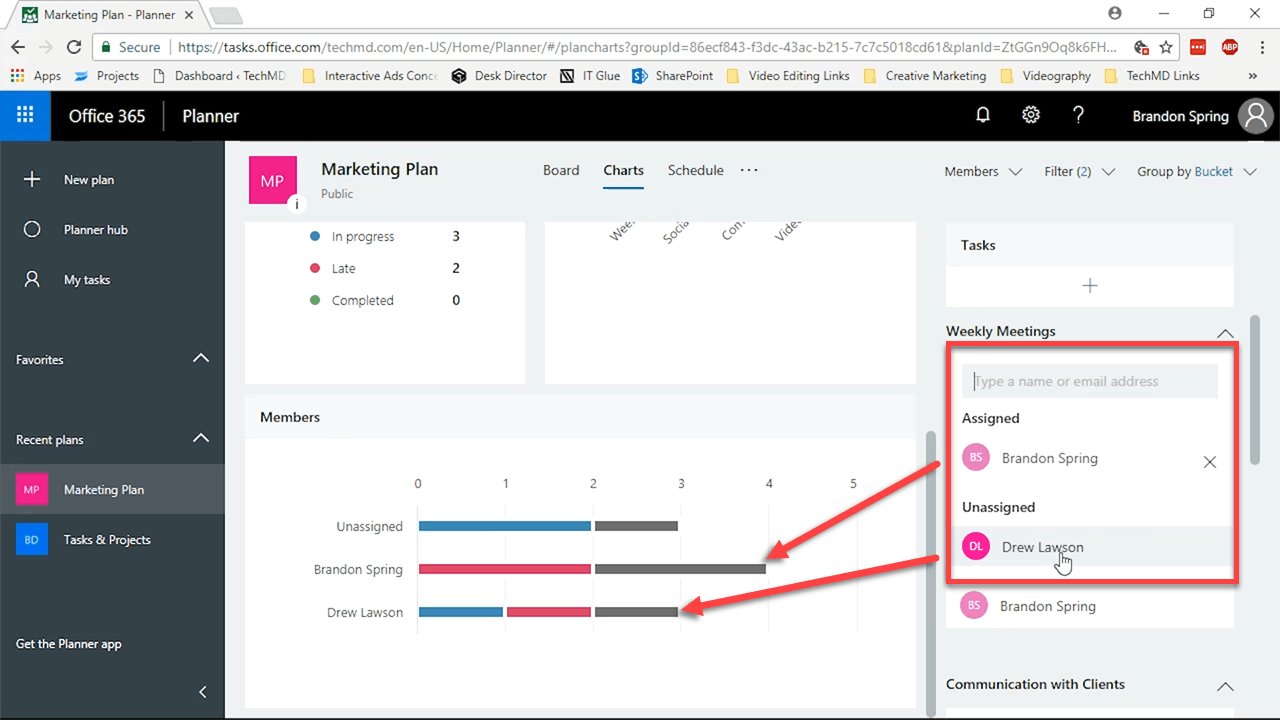
Beneath the Status window you’ll find another called Members. This portion is useful because it shows you exactly who among your team is doing what.
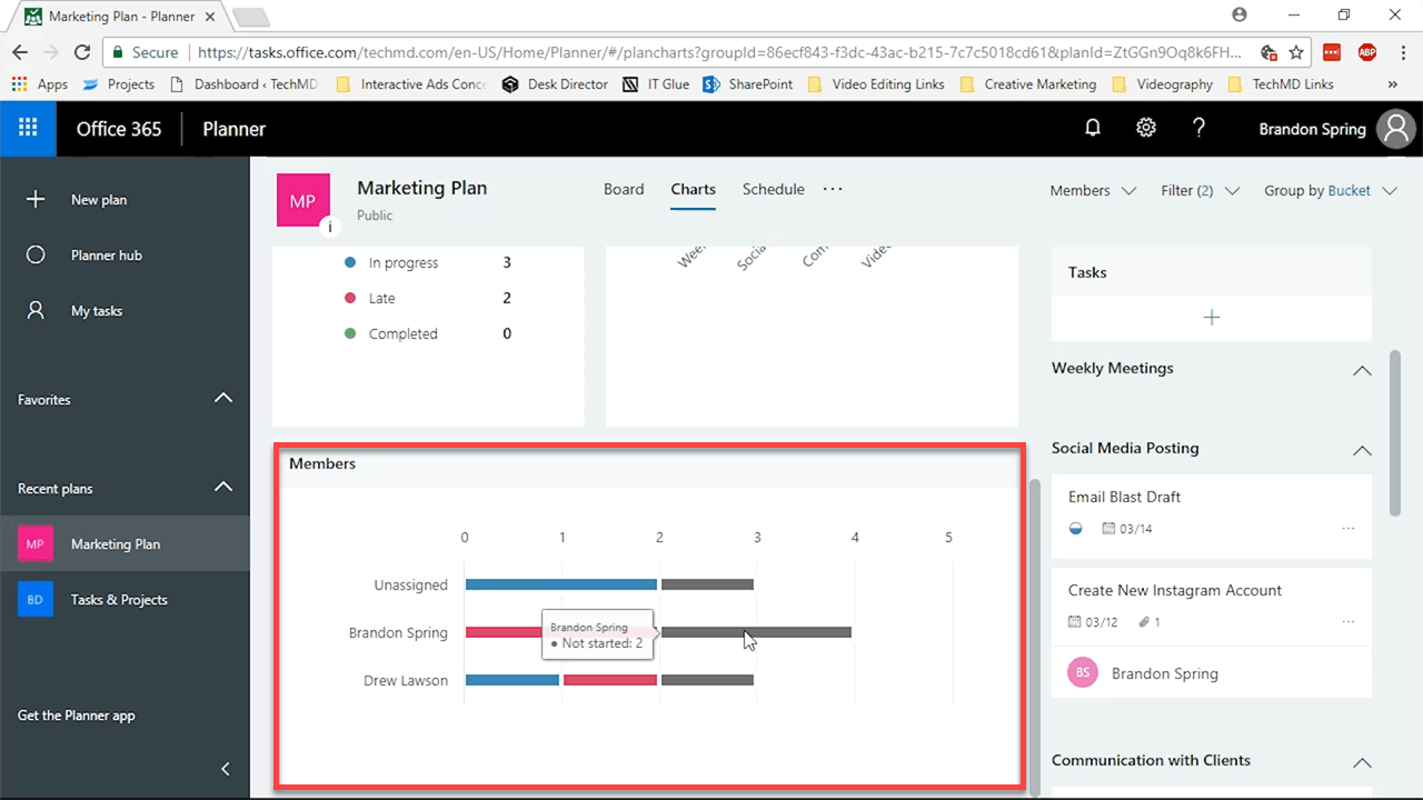
The advantage here is the ability to reassign tasks between team members. So if someone is running behind or has too much on their plate, you can rearrange assignments based on your needs.
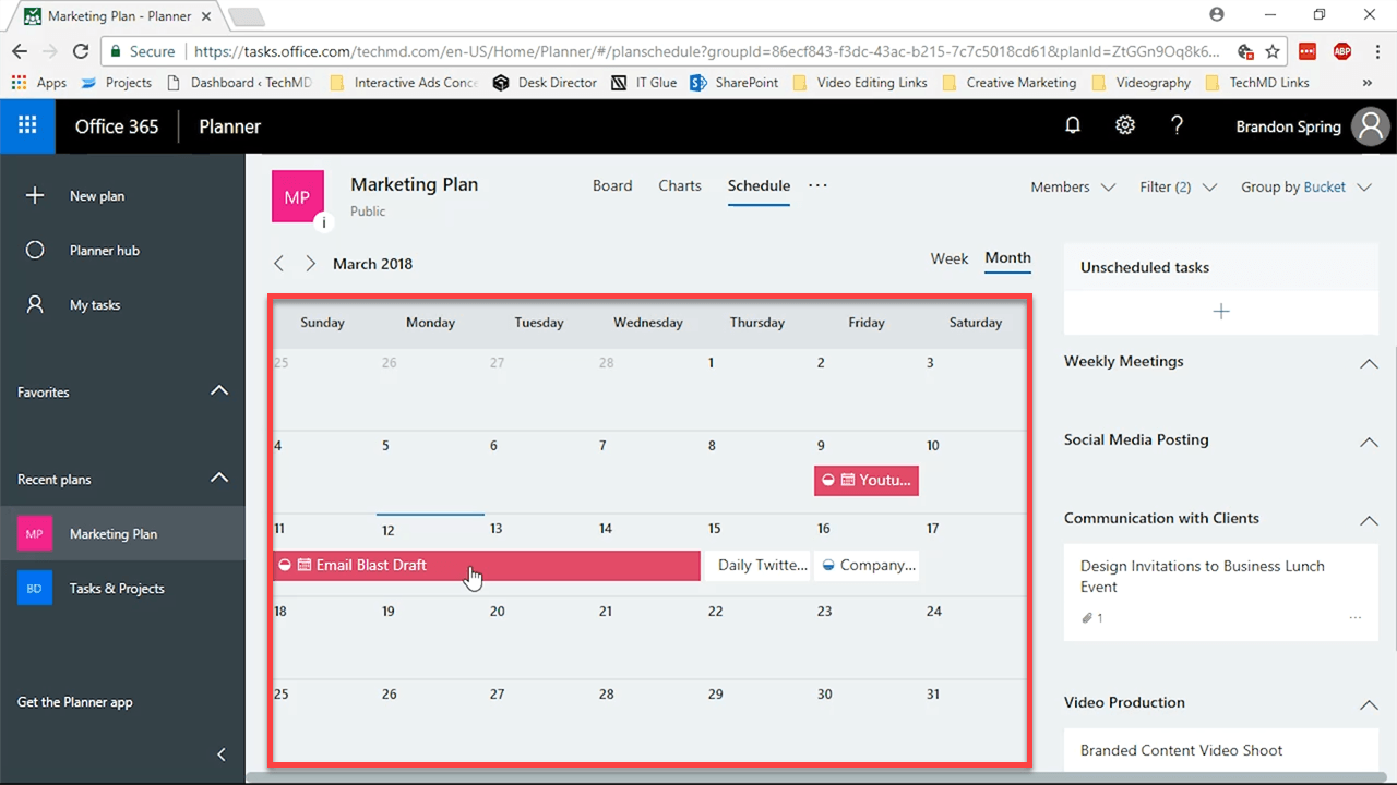
The Schedule View
Finally, we’ll look at the Schedule view. Schedule view gives you a calendar filled with the tasks you’ve created and their running dates. It gives you another useful way to see the progression of your work and efficiency of the plan you’ve designed, along with whether a task ought to be rescheduled or not.