
Do you need a way to present data clearly and visually to your clients and team? Try using charts in Microsoft Word! On this week’s One Minute Wednesday, we’ll be showing you how to create a customizable chart that presents your data in a way that’s visual and informative.
Creating Charts in Microsoft Word
Microsoft Word gives you an easy way to visually communicate data with its charting tool. You can easily create customizable charts to represent budgets, data trends, inventory quantities, or any other information you’ve gathered, giving co-workers or clients a clean, visual representation of your data. Let’s take a look at how to create and customize a chart.
So let’s say we have a budget that we want to convert into a chart. To do this, first go to the “Insert” tab and find the “Chart” button.

Once clicked, the “Insert Chart” window will appear, giving you a wide selection of chart types to choose from based on your needs. For this example, we’ll click “Pie Chart”. Then click “Ok”.

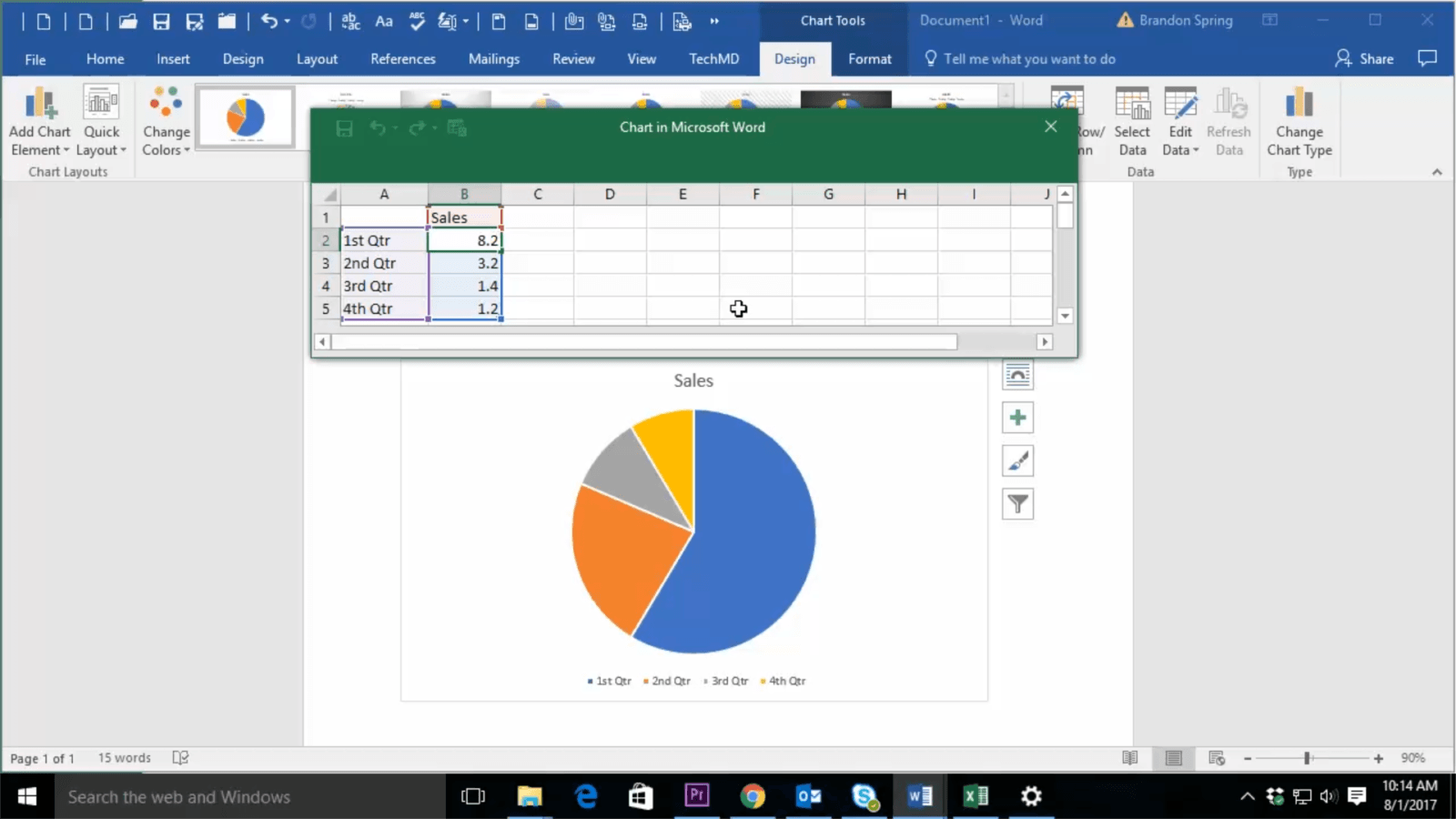
Now your Pie Chart will appear, along with an Excel Window containing your data. You’ll see that the Pie chart is automatically populated with your data, which can be modified in the Excel window. If the information is changed, the chart will reflect that change.
Customizing Charts
At this point, we can customize the chart to better fit our needs. First, let’s head to the Design tab in the Ribbon Bar. Here you have the option to: (1) add or change the chart elements, such as the position of the titles and labels, (2) adjust the layout of the chart, (3) change the color palette of the entire chart, (4) make a new chart style, (5) edit the data housed in the chart, or (6) switch the actual chart type.

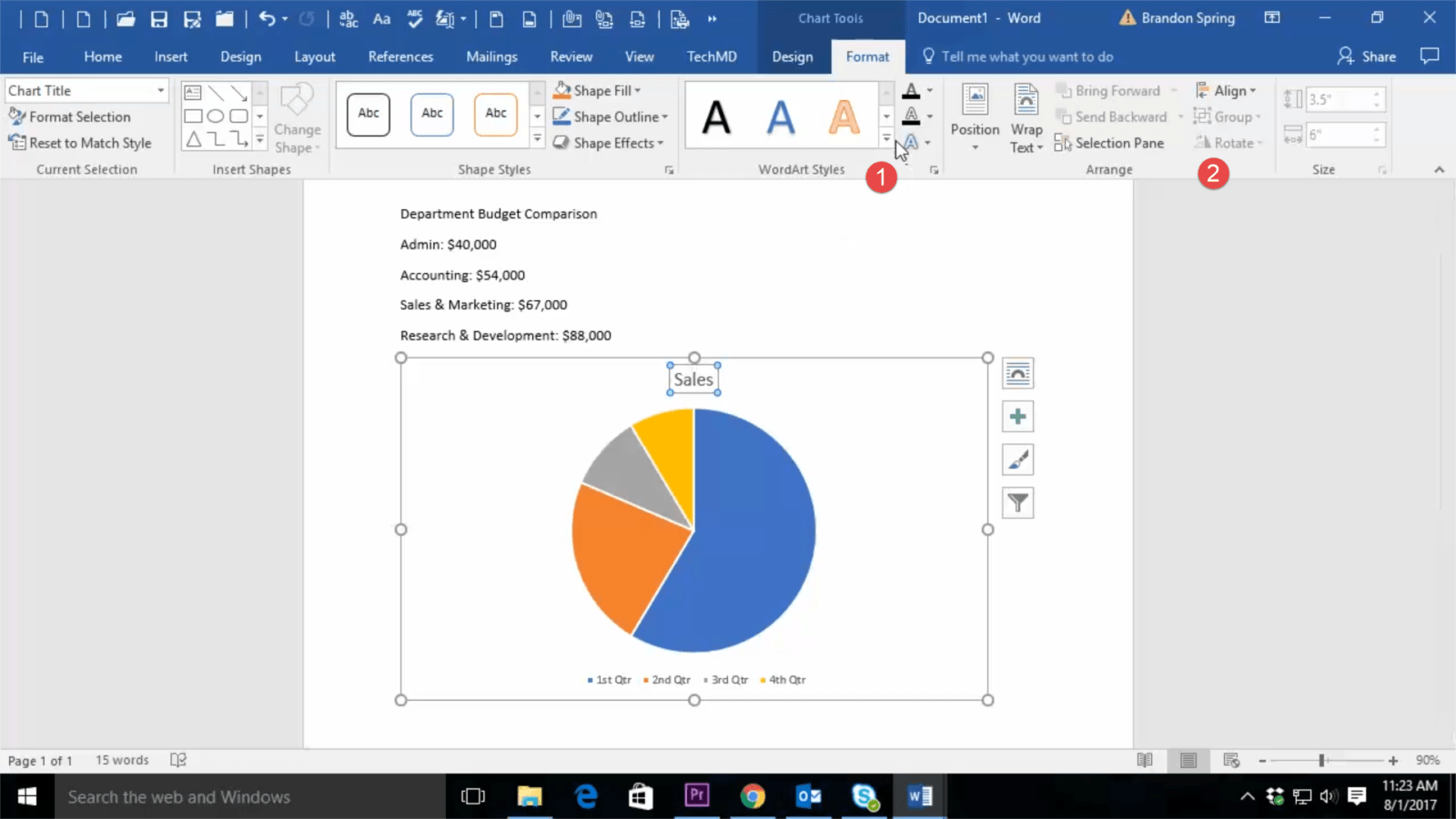
Now if we navigate to the “Format” tab, we can adjust the formatting of the chart such as (1) adding Word/Art Styles and (2) rearranging the placement of the text, along with additional formatting options.
All of these options give us the ability to build a visually-appealing chart that can give our audience a better understanding of our information. Thanks for joining TechMD for this week’s episode, and be sure to check out next week’s One Minute Wednesday!
About TechMD
TechMD is an award-winning IT services firm that specializes in managed IT services in Orange County and Los Angeles, managed cybersecurity, cloud solutions, and strategic IT consulting. We are passionate about bringing enterprise-level productivity, scalability, and security to small and medium businesses.